Helping patients navigate the most consequential decision of their lives
After completing treatment for stage 0–III breast cancer, patients face an annual surveillance question their doctors often couldn’t answer for them: standard mammography, or add breast MRI? MRI may detect recurrence earlier — but it also brings false alarms, unnecessary biopsies, cost, and anxiety. There is no universally right answer. The right choice depends on each patient’s individual risk profile and, critically, on what tradeoffs they’re willing to accept.
Three million breast cancer survivors face this decision every year with almost no guidance. They arrive at it already exhausted — post-treatment, managing fear of recurrence, often overwhelmed by medical information they’d been absorbing for months or years. Yet the clinical system had no structured way to help them think it through. Group Health Research Institute (GHRI) partnered with Artefact to build one.
GHRI’s SIMBA study (2013–2016) analyzed 36,000 breast cancer exams — the largest effectiveness analysis of mammography and breast MRI at that time. The data existed. The challenge was making it meaningful at the individual level, for a patient sitting at home, scared, trying to figure out what to ask her oncologist.
Research engaged patients, caregivers, and clinical staff to understand how the decision was actually being made — and where it was breaking down. My role focused on evaluative UX research across iterative design cycles: testing how well patients could parse personalized risk data, whether the values-clarification prompts actually surfaced what mattered to them, and whether the visualizations were helping or inadvertently introducing bias. Cognitive psychology and behavioral economics consultants shaped how options were framed and displayed; plain language experts ensured the content was accessible across education levels.
“This information has prompted me to talk to my oncologist about my breast density and if that would indicate an MRI might be warranted.” — Breast cancer patient, Artefact interview
Iterative usability testing drove structural decisions — sequencing values reflection before presenting clinical options, calibrating how numerical risk data was paired with pictographs, and identifying which plain-language framings reduced rather than amplified anxiety. Each round of evaluation tightened the gap between what we intended the tool to do and what patients actually experienced when they used it.
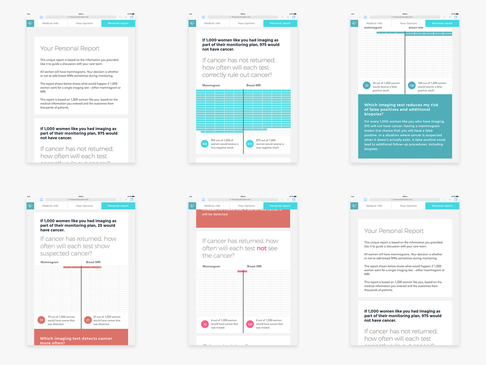
Personalized risk report: numerical, text, and pictograph formats calibrated to minimize cognitive bias; tailored to each patient’s unique medical history; and highlighting personally important factors
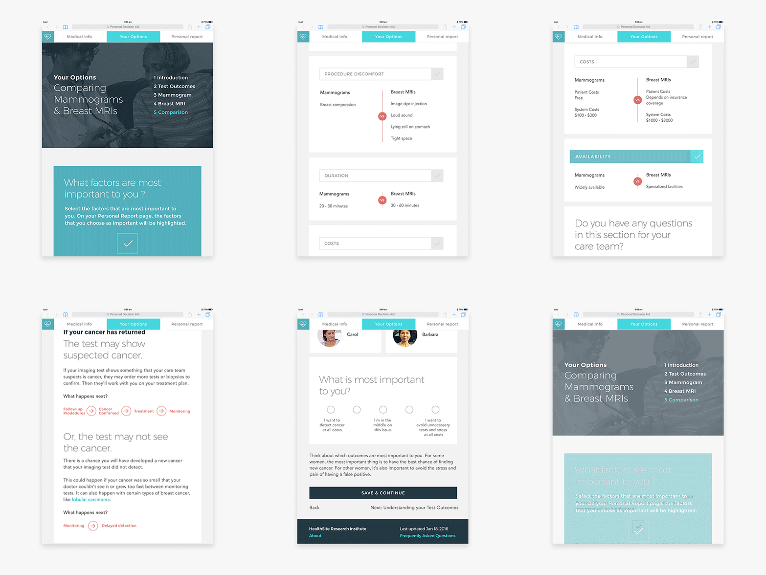
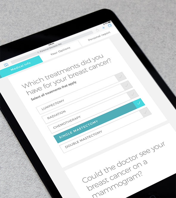
Reflecting individual values: guided prompts helping patients identify what they’re optimizing for and encouraging reflection on each topic before seeing options
The finished tool generated a personalized report based on each patient’s medical history and GHRI’s effectiveness data — presenting risk information in numerical, text, and pictograph form, with visualizations designed to surface tradeoffs rather than steer toward an answer. Guided value-reflection prompts helped patients articulate what they were actually optimizing for: fear of missed detection, tolerance for false alarms, cost sensitivity, how they weighed convenience against thoroughness.
The tool was designed to be used before a clinical appointment — mobile-optimized, printable, and emailable — so patients arrived at physician conversations with a clear picture of their own priorities. That shift changed the nature of the conversation: less explaining-from-scratch, more shared deliberation. Patients came prepared. Clinicians had a shared framework to work from.
Science-backed visualizations to reduce bias in our design: grounded in behavioral economics, cognitive psychology, and human-computer interaction and designed to surface tradeoffs rather than nudge toward a predetermined answer
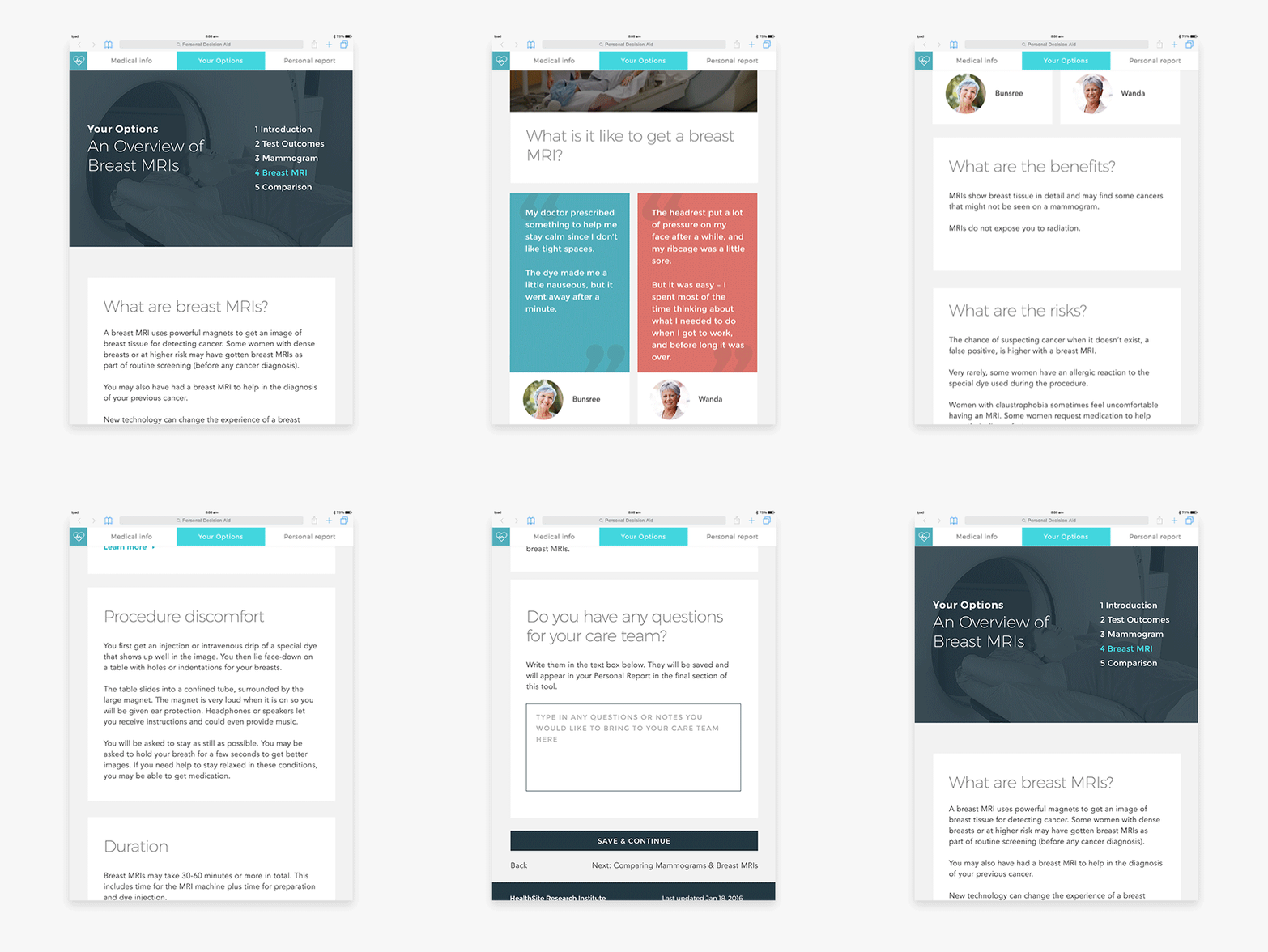
Content reviewed with plain-language experts for accessibility across education levels and English proficiency, deliverable as mobile, print, or email, and organized by topic using a “card” metaphor to improve readability
“Human-centered design turned the insights from our research into a tool that can help breast cancer patients feel confident and comfortable with their decisions in time of high anxiety. SIMBA is a great example of what patient research and human-centered design can do together.” — Karen Wernli, Group Health Research Institute
The finished SIMBA decision aid: personalized risk report, values reflection, and next-step guidance in a single patient-facing tool
Beyond usability, the goal was to help women develop genuine informed preference — not just comprehension of the risk data, but clarity about what mattered most to them personally. Alongside in-person feedback sessions, we ran a randomized controlled trial to test whether the design work actually changed outcomes: 33 breast cancer patients used our design, and 33 used a standard decision aid representative of what’s typically available online today. Women who used our design reported significantly less decisional conflict when choosing a post-treatment monitoring option (p < .05) — feeling more informed about the benefits and risks of each option, and more certain that their choice reflected what actually mattered to them. That self-reported sense of being informed held up against an objective check, too: on a follow-up knowledge quiz, women using our design averaged 80%, against 70.9% for the standard design.
We also verified the design against two external benchmarks: the International Patient Decision Aid Standards checklist (Durand et al., 2015), and a second set of minimum criteria defined with our client and grounded in our own research — covering patient-facing needs like plain language and graceful handling of “I don’t know” responses, and clinician-facing trust signals like disclosed data sources and update cadence. The design met every qualifying criterion on both.
Breast cancer survivors facing this decision annually — with almost no structured guidance available before SIMBA.
Patient confidence and preparation: clearer priorities, better questions, more productive physician conversations.
Anxiety in a population already managing fear of recurrence — addressed through sequencing, plain language, and bias-reducing visualizations.
A proof point that human-centered design can make a measurable difference in high-stakes clinical decision-making — not just satisfaction, but quality of choice.